Mastering the Pantone Color Book: A Comprehensive Guide for Designers in Bangladesh
In the vibrant world of design, accurate color representation is paramount. The Pantone Color Book serves as an essential tool for designers, ensuring consistency and precision across various mediums. This guide delves into the effective use of the Pantone Color Book, introduces the latest Pantone models with their SKU numbers, and provides a step-by-step approach to utilizing the Pantone system flawlessly.
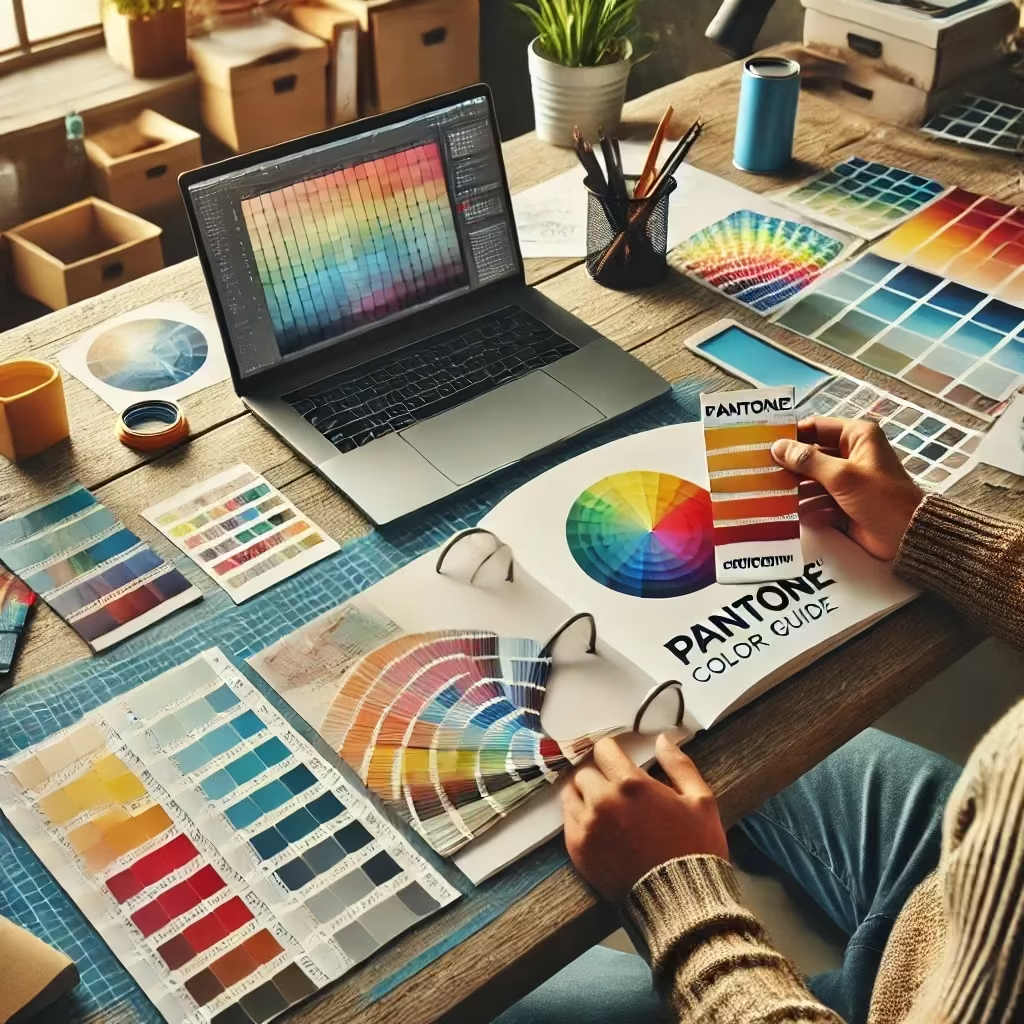
Understanding the Pantone Color Book
The Pantone Color Book is a standardized color reproduction system, widely adopted across industries such as graphic design, fashion, and printing. It enables designers and manufacturers to communicate exact color specifications, ensuring uniformity regardless of location or equipment.
Latest Pantone Models and Their SKU Numbers
Staying updated with the newest Pantone models is crucial for accessing the latest color trends and formulations. Here are some of the recent additions:
- Pantone Formula Guide Set | Coated & Uncoated
- SKU: GP1601B
- Description: This set features 2,390 market-driven spot colors presented in two compact fan decks, ideal for graphic and print projects.
- Pantone Fashion, Home + Interiors Color Guide New Edition 2023
- SKU: FHIP110A
- Description: A comprehensive guide showcasing the latest colors tailored for fashion and interior design applications.
- Pantone Fashion, Home + Interiors Cotton Passport Dualities Expansion Pack
- SKU: FHIC210C
- Description: An expansion pack introducing 175 new colors, curated into two distinct palettes, enhancing the existing Cotton Passport collection.
Guidelines for Optimal Use of the Pantone Color Book
To harness the full potential of your Pantone Color Book, adhere to the following best practices:
- Familiarize Yourself with the Layout: Begin by exploring the structure of the color book. Colors are typically organized systematically, allowing for easy navigation and selection.
- Utilize the Index: The index is an invaluable tool for quickly locating specific colors by their Pantone number, streamlining your workflow.
- Assess Colors Under Proper Lighting: Always evaluate colors in a well-lit environment, preferably under natural daylight or standardized lighting conditions, to ensure accurate perception.
- Consider Paper Stock Variations: Be mindful of how colors appear on different paper types. The same Pantone color can look distinct on coated versus uncoated paper, so choose accordingly based on your project requirements.
- Maintain and Update Your Guides: Regularly update your Pantone guides to access the latest colors and formulations. Over time, colors can fade or become outdated, impacting the accuracy of your work.
- Leverage Digital Tools: Complement your physical color book with Pantone’s digital resources and software for precise color matching and integration into your digital design projects.
Pantone in Bangladesh
For designers in Bangladesh, the Pantone Color Book is an indispensable asset, ensuring that designs meet international color standards. Whether you’re working in fashion, interior design, or graphic arts, utilizing the Pantone system guarantees that your creations resonate with the intended audience and maintain consistency across various platforms.
Mastering the use of the Pantone Color Book elevates the quality and consistency of your designs. By staying informed about the latest models and adhering to best practices, you can ensure that your work stands out and communicates the desired message effectively.
A Complete Guide to Using the Pantone Color Book Perfectly
The Pantone Color Book is an essential tool for designers, printers, and manufacturers to ensure accurate color communication. Whether you’re working in graphic design, fashion, printing, or product development, following a proper method for using the Pantone guide can make a significant difference in color accuracy and consistency.
✅ Step-by-Step Guide to Using a Pantone Color Book
Step 1: Choose the Right Pantone Guide for Your Needs
Pantone offers different types of color books, each designed for specific industries:
- 🎨 Pantone Formula Guide (Coated & Uncoated) – For printing and branding, providing spot colors.
- 🖍️ Pantone CMYK Guide – For four-color process printing, helping convert spot colors to CMYK.
- 👗 Pantone FHI (Fashion, Home + Interiors) Guide – For fabric, textiles, and interior design.
- 🖥️ Pantone Color Bridge Guide – Shows Pantone spot colors alongside CMYK, RGB, and Hex values for digital and print consistency.
🔹 Pro Tip: Choose the coated (C) guide for glossy materials and uncoated (U) for matte or rough textures.
Step 2: Find & Match the Right Color
1️⃣ Identify the desired color using the swatches in the Pantone book.
2️⃣ Check colors under proper lighting conditions – Always view them in natural daylight or a color-balanced light source.
3️⃣ Compare the Pantone swatch to the actual printed or digital version to ensure accuracy.
🔹 Pro Tip: Avoid using old or faded Pantone books, as colors may shift over time due to exposure to light and air.
Step 3: Convert Pantone Colors for Digital & Print
- If you are working on a digital design, use Pantone Color Bridge to get the RGB and Hex values for screen compatibility.
- If you are printing, ensure that your printer supports spot colors or use the CMYK equivalent for a close match.
🔹 Pro Tip: Always consult with your printer or manufacturer to confirm how the colors will be reproduced.
Step 4: Use Pantone Colors for Branding & Consistency
- Brands use Pantone to maintain color consistency across different materials and platforms.
- Example: Coca-Cola Red (Pantone 484 C) is the same across print, packaging, and advertisements.
- When working with a team, always specify Pantone color codes instead of generic color names.
Step 5: Keep Your Pantone Book Updated
Pantone regularly introduces new colors, so it’s essential to use the latest version of the guide. Some of the new Pantone models include:
- Pantone Connect – A digital extension for Adobe users.
- Pantone FHI TPG Color Guide – Latest fashion and home colors.
- Pantone Formula Guide 2024 Edition – New trend colors for printing.
🔹 Pro Tip: If your Pantone book is over two years old, consider getting a new one to ensure color accuracy.
🔥 Final Thoughts
Using a Pantone book correctly ensures precise color communication and professional quality results in design, printing, and branding. Follow this guide to get the most out of your Pantone color book and maintain consistent colors across all your projects!
Order Now: 01611-828220
📢 #Pantone #PantoneBangladesh #ColorMatching #DesignTips #PantoneGuide #GraphicDesign #PrintingSolutions #ColorConsistency